MoMA Website Redesign
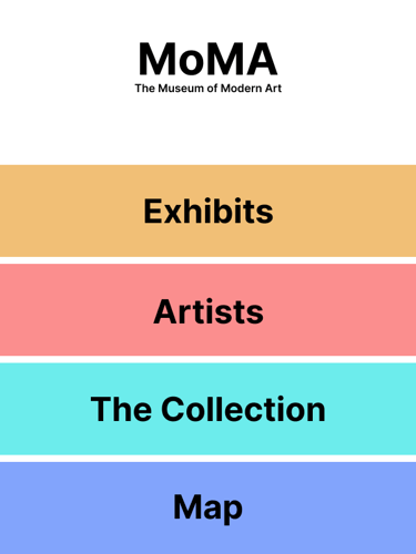
For this project, I redesigned the MoMA (Museum of Modern Art) website in 2 ways : implementing a new navigation bar on the original website & changing the modality to a public screen system.
Initial Website Research
To start, I analyzed the original website using 5 usability heuristics:
Visibility of System Status
Match between the System & the Real World
User Control & Freedom
Consistency & Standards
Aesthetic & Minimalist Design
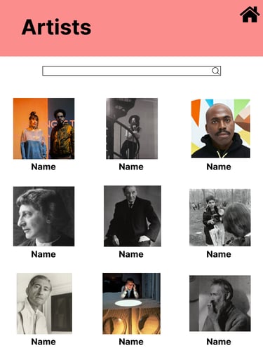
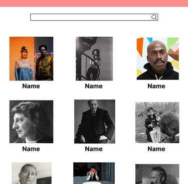
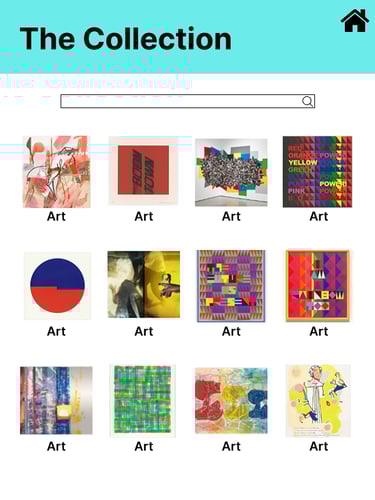
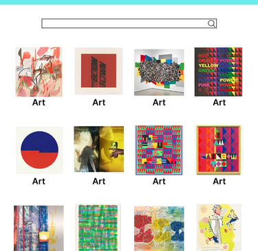
Using these heuristics I discovered a few problem areas - the main one i decided to focus on after conducting a qualitative study was the navigation bar.
I posed the question:
"What do users expect the navigation bar on the site to look like?"
Inclusive Design
To further inform my design, I conducted further research into designing for persons with disabilities. I chose 2 influencers: Molly Burke & Zach Anner who have multiple differing disabilities that I wanted to consider in my designs.
I then gathered ethnographic data from people online with the same or similar disabilities. Through the 2 influencers I researched and the ethnographic data i gathered I decided to look at 4 specific disabilities:
Visual Impairments
Cerebral Palsy
Chronic Pain
Mental Health
Using the research and data as well as further academic research into the 4 disabilities, I created 2 persona's to use for persona walkthroughs for the new website design. These would help me identify any problematic areas that persons with disabilities would have when using the website.
Finally, I created design requirements for the new website that needed to be met to account for these users.
Easy to understand navigation menu
Website must work with screen readers/narrators
Allow for navigation without a mouse
Responsive with visual and auditory feedback
A larger clickable area
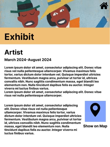
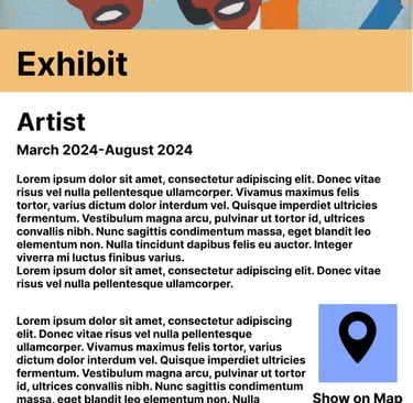
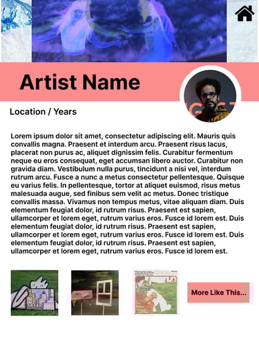
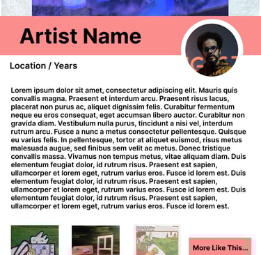
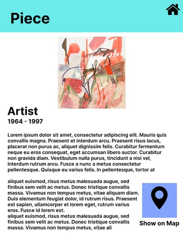
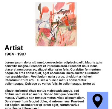
Final Design & Redesign
For the final design of the website, I identified 3 main elements that needed to be updated for the website to be more accessible:
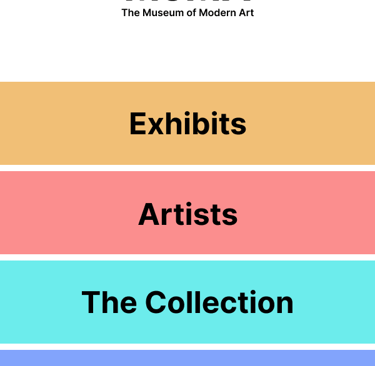
Navigation bar
Clickable area size
Usable with screen readers/narrators
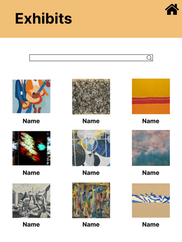
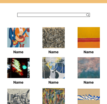
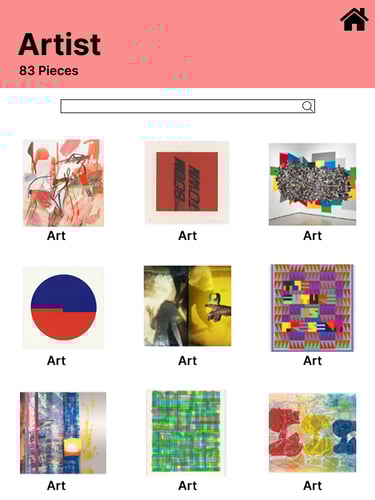
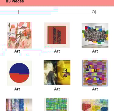
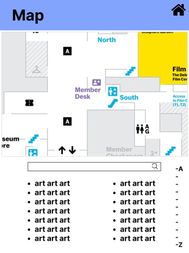
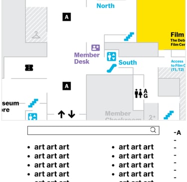
For the redesign I chose to convert the website to a public screen system. These would be screens that users could find throughout the museum and could be used as a map or for more information on the exhibits. Due to the change in modality from the website, a lot of the changes that needed to be made for the website could not be used on the public screen.
To test how usable my public screen system was, I conducted a think-aloud session to get real time information from users while they tested.
Medium Fidelity Prototype